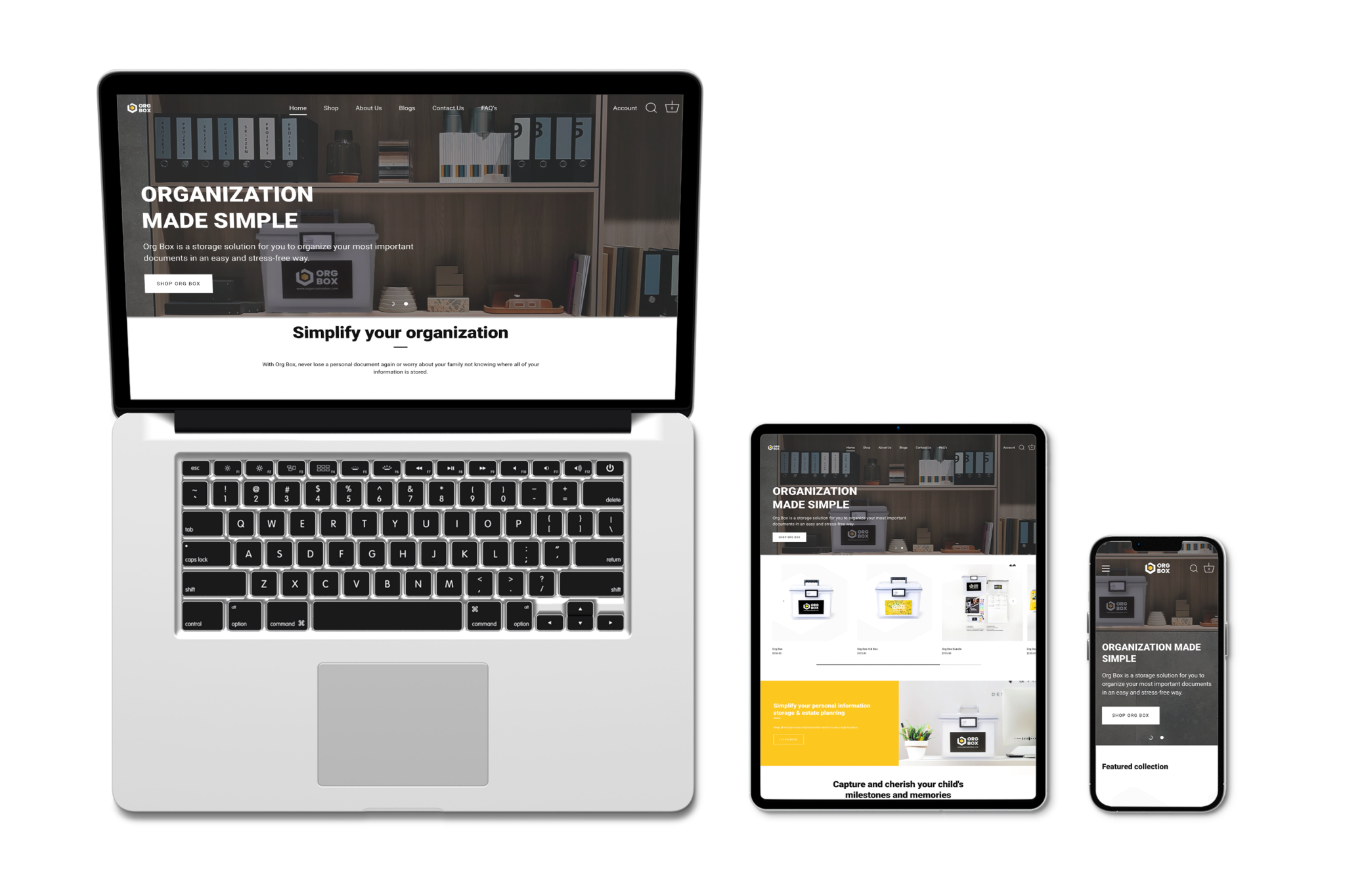
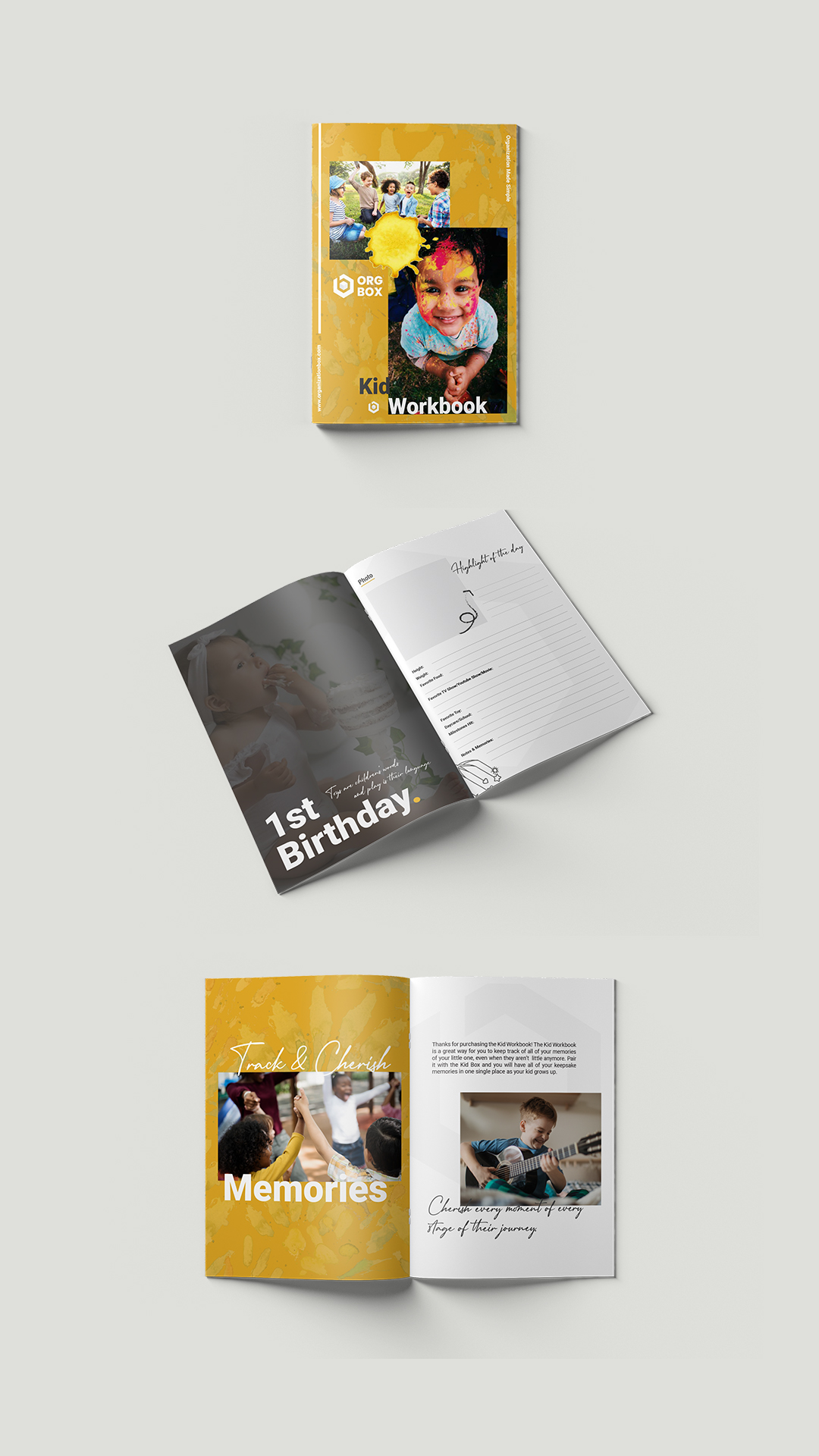
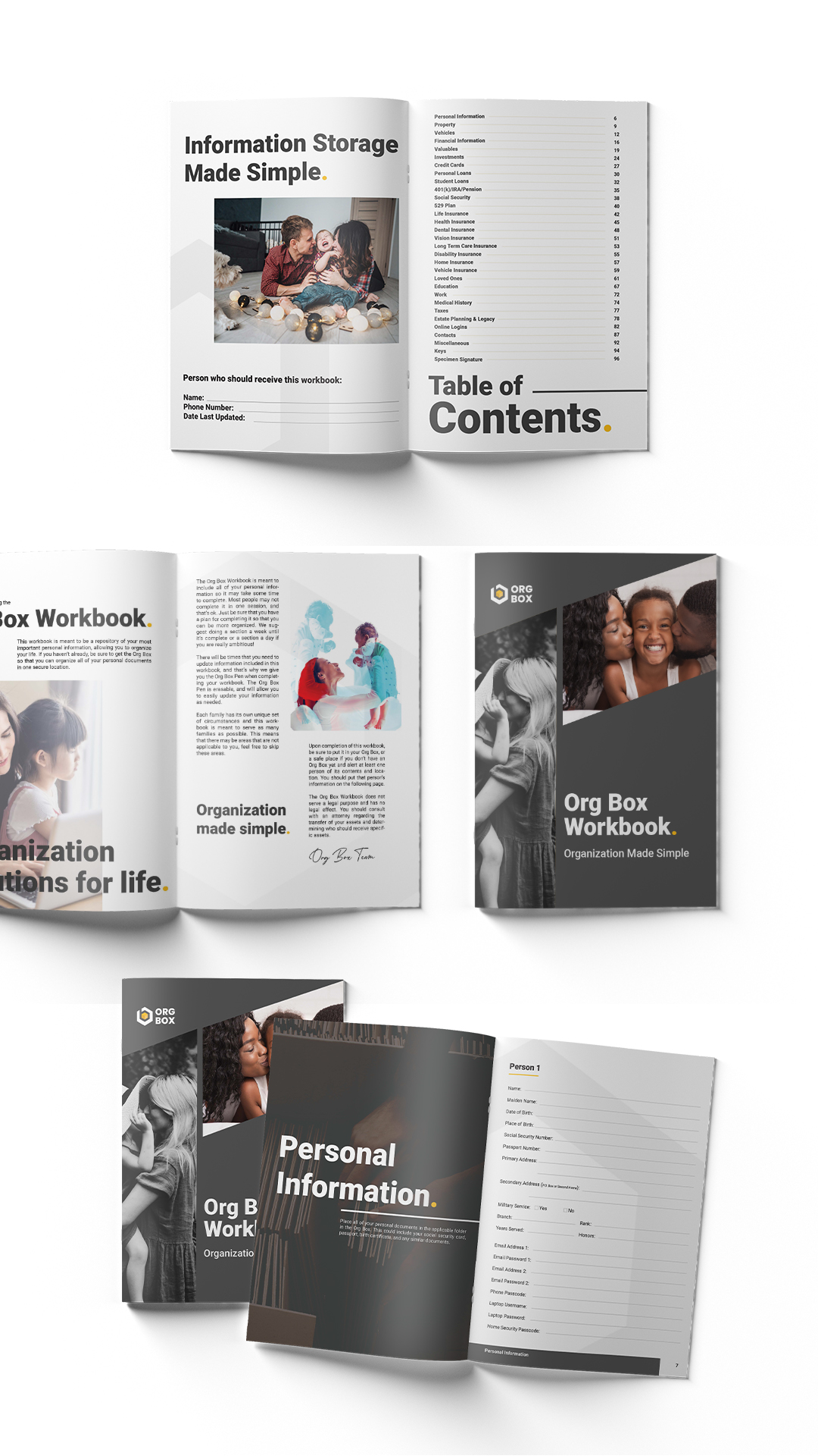
Org Box is a modern storage solution built specifically for parents, helping them keep life’s most important documents safe, accessible, and neatly organized. With a strong focus on ease and peace of mind, Org Box transforms the often stressful task of paperwork management into a streamlined and empowering experience
Visual Identity.
We took a brand-first approach to create a cohesive, intuitive, and deeply strategic identity for Org Box—designed to resonate with modern parents and make organizing feel effortless.
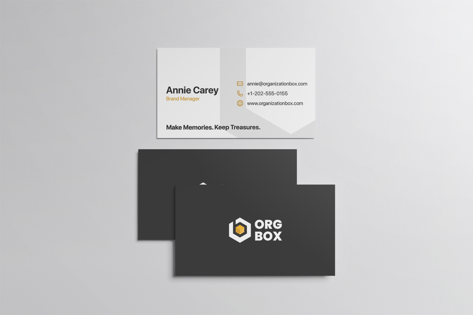
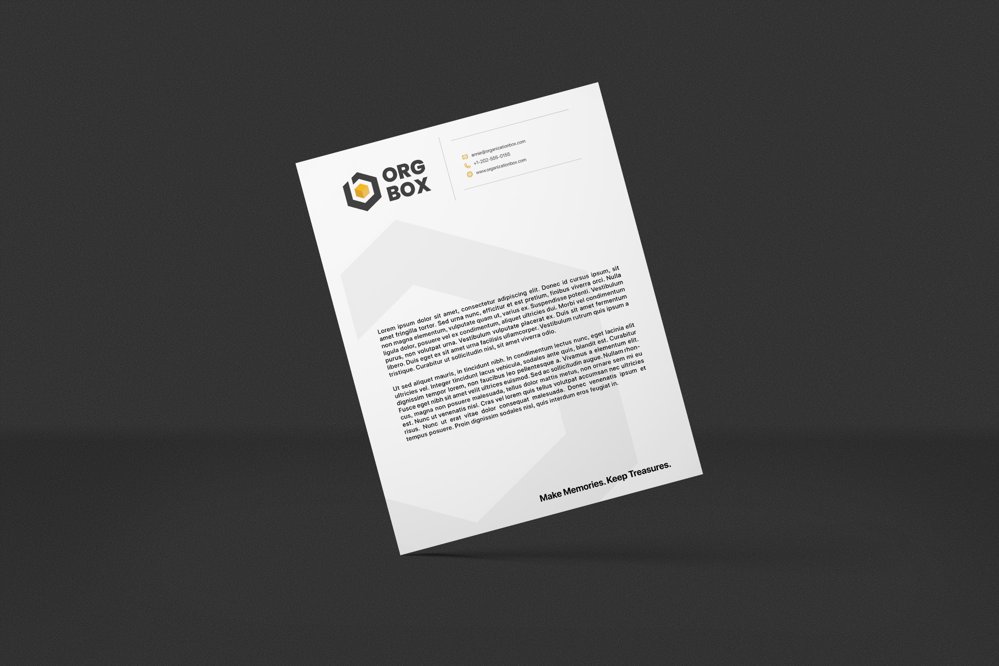
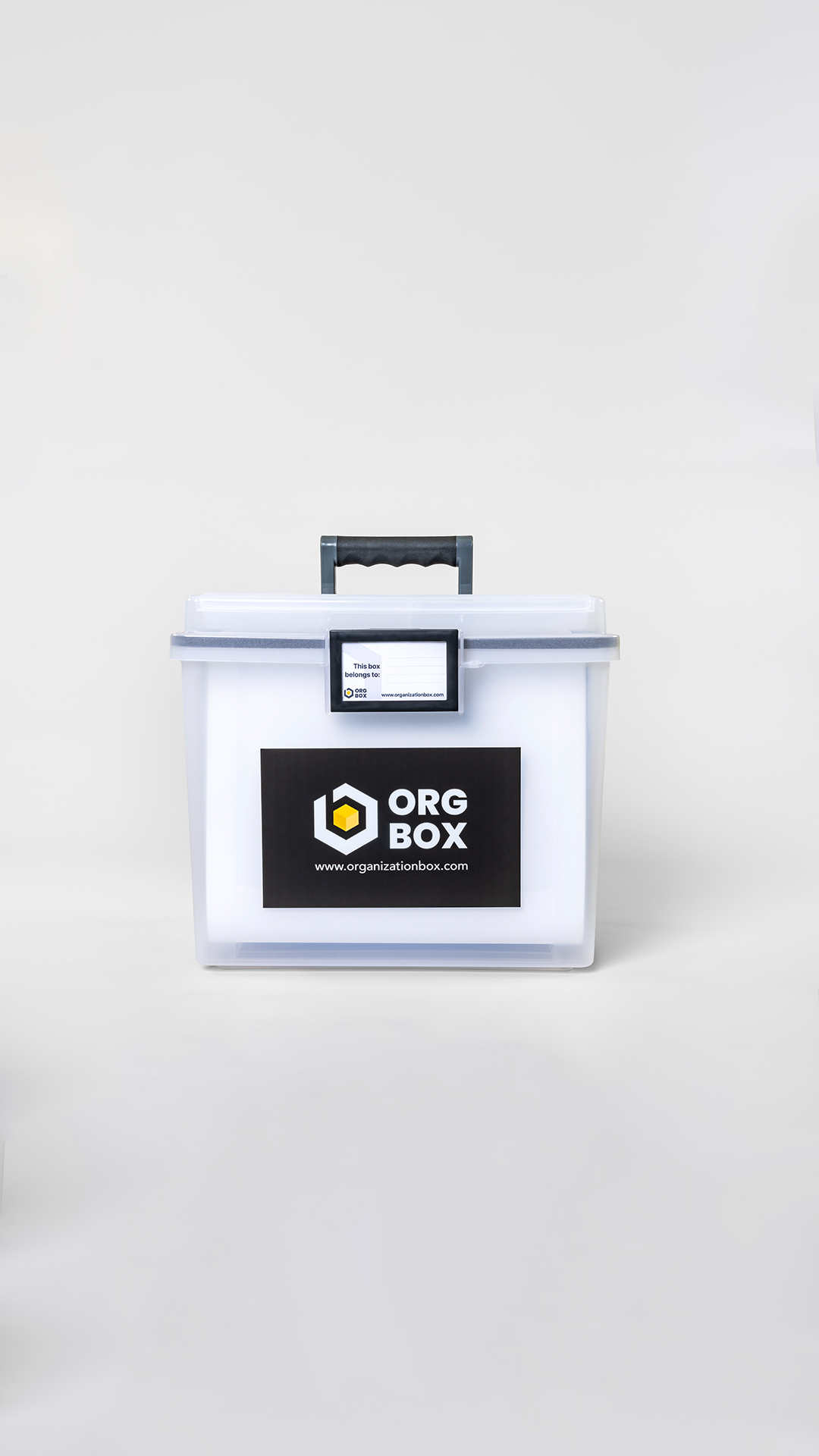
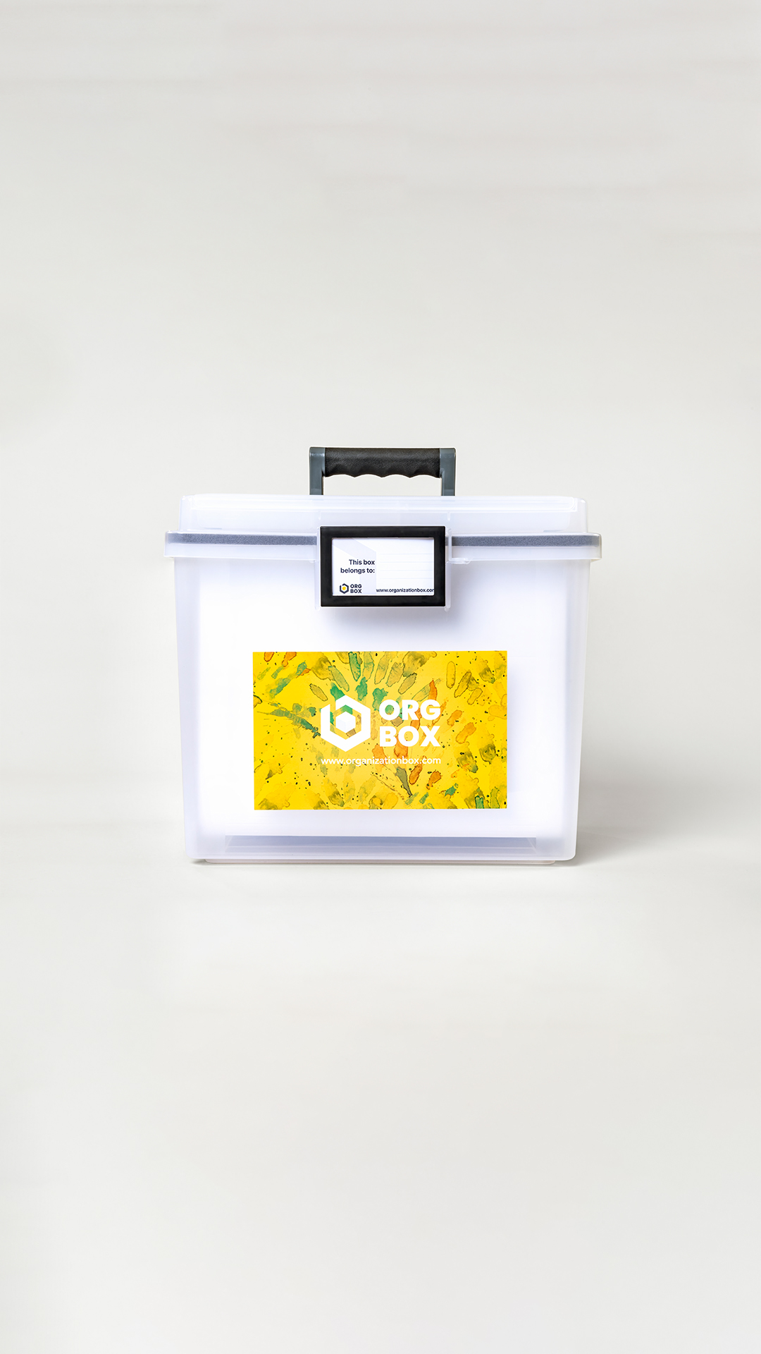
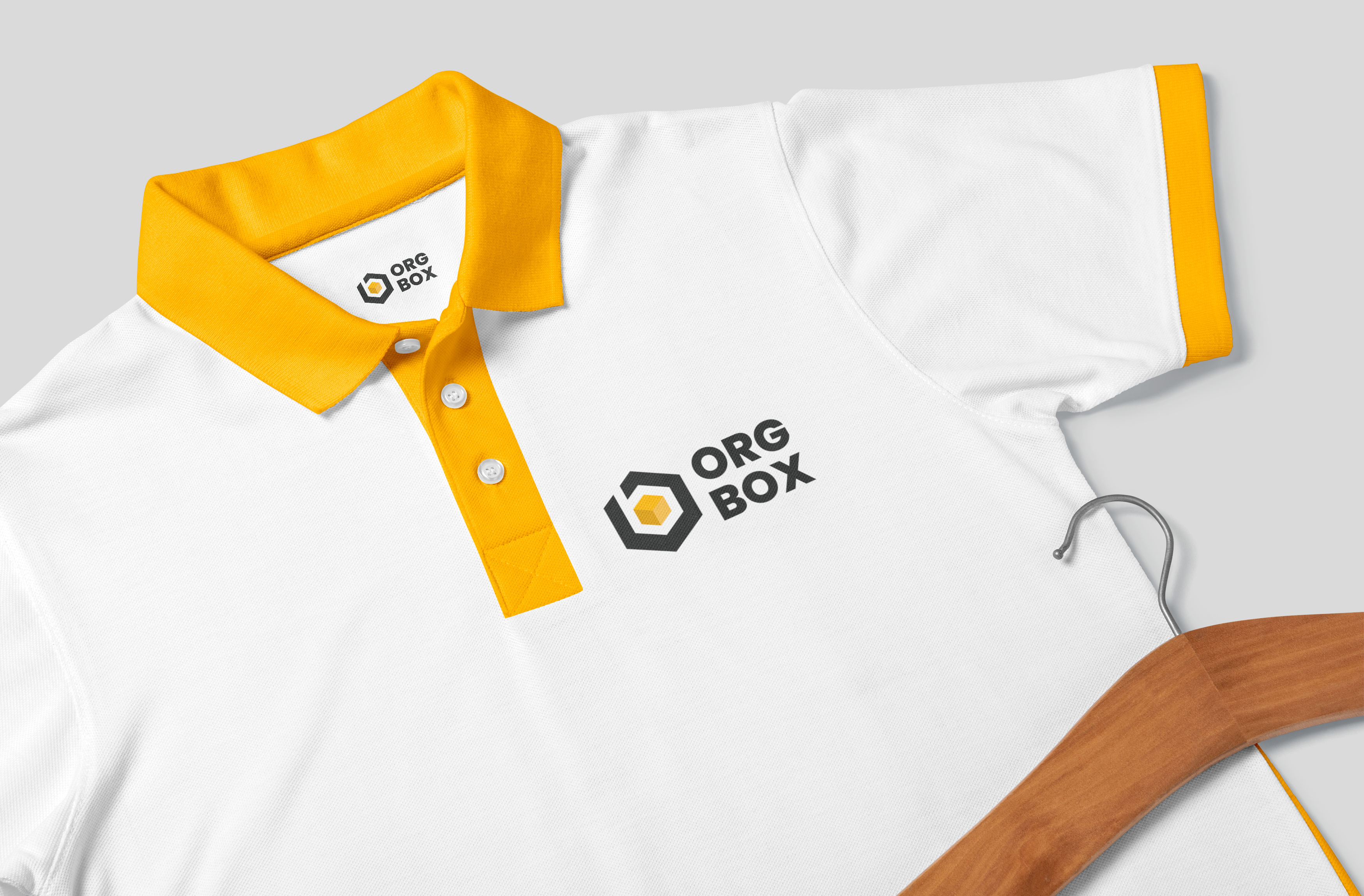
The Org Box logo, built around the concept Calm Within the Box, features a minimalist square icon that symbolizes structure, containment, and clarity. Its clean lines and bold form reflect strength and simplicity, while the box represents both a literal container and a metaphor for mental clarity and peace of mind. Paired with a modern sans-serif typeface, the logo delivers a polished, professional impression.
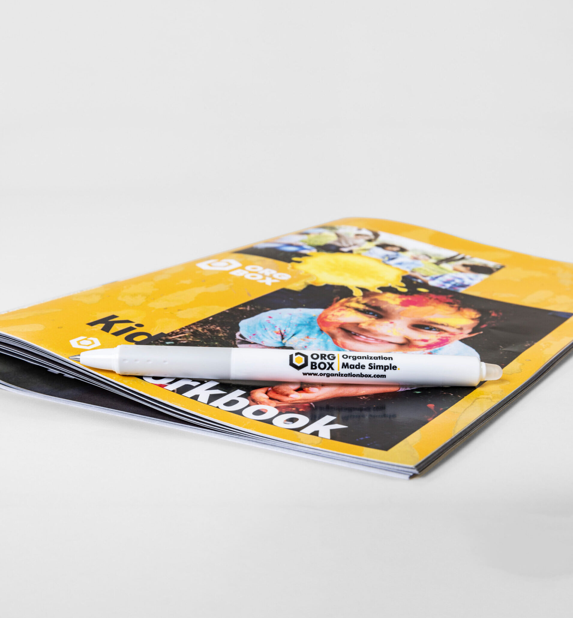
For the visual language, we chose a deep grey to anchor the palette—conveying maturity, dependability, and calm—complemented by soft neutrals and muted tones that evoke a clutter-free, stress-free environment. The design system embraces white space for breathability, grid-based layouts for order and harmony, and gentle illustrative icons to guide users through each interaction with ease.
Let’s bring your vision to life—strategic, bold, and made to grow.
If you’re ready for a brand that looks good and works hard, we’re here to design it with purpose, clarity, and impact.