The Arch to Freedom Project is a recovery center committed to guiding individuals on their journey to healing and transformation. Rooted in compassion and empowerment, the organization provides safe spaces and programs that focus on recovery, growth, and personal freedom.
Project Scope.
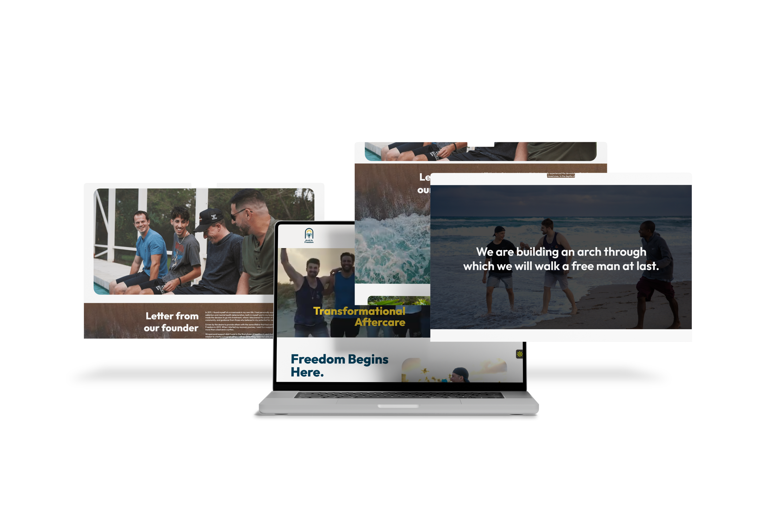
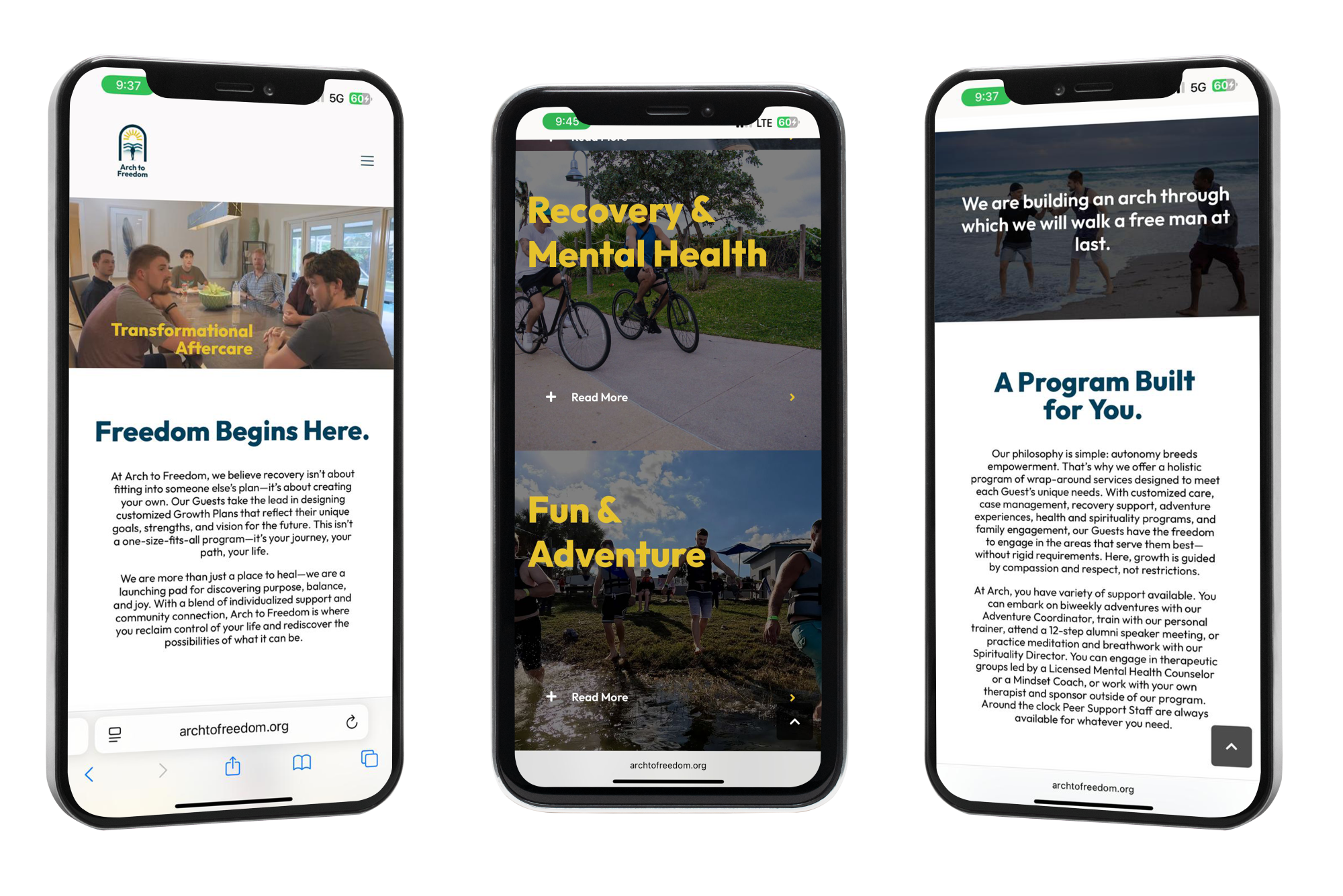
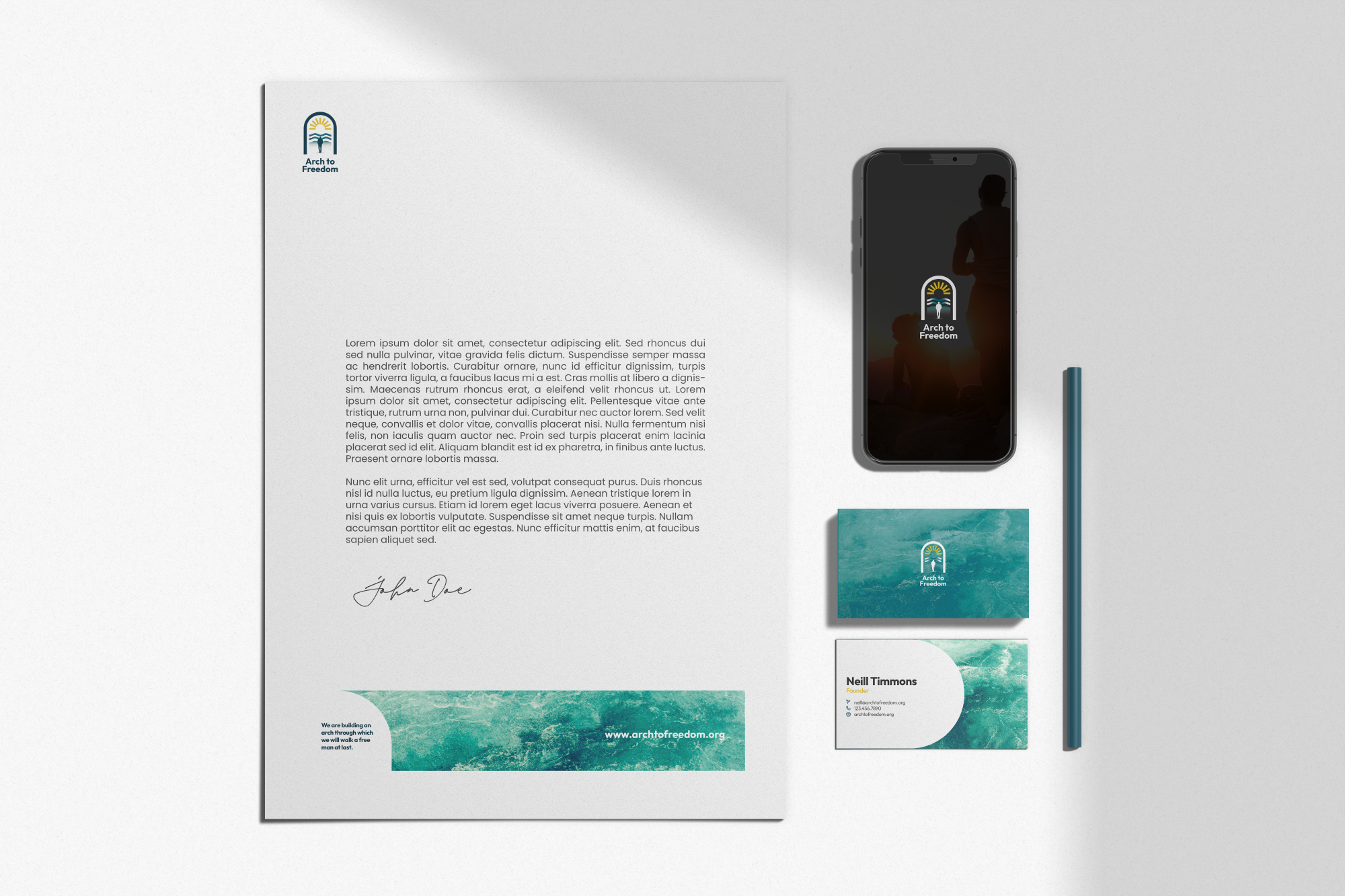
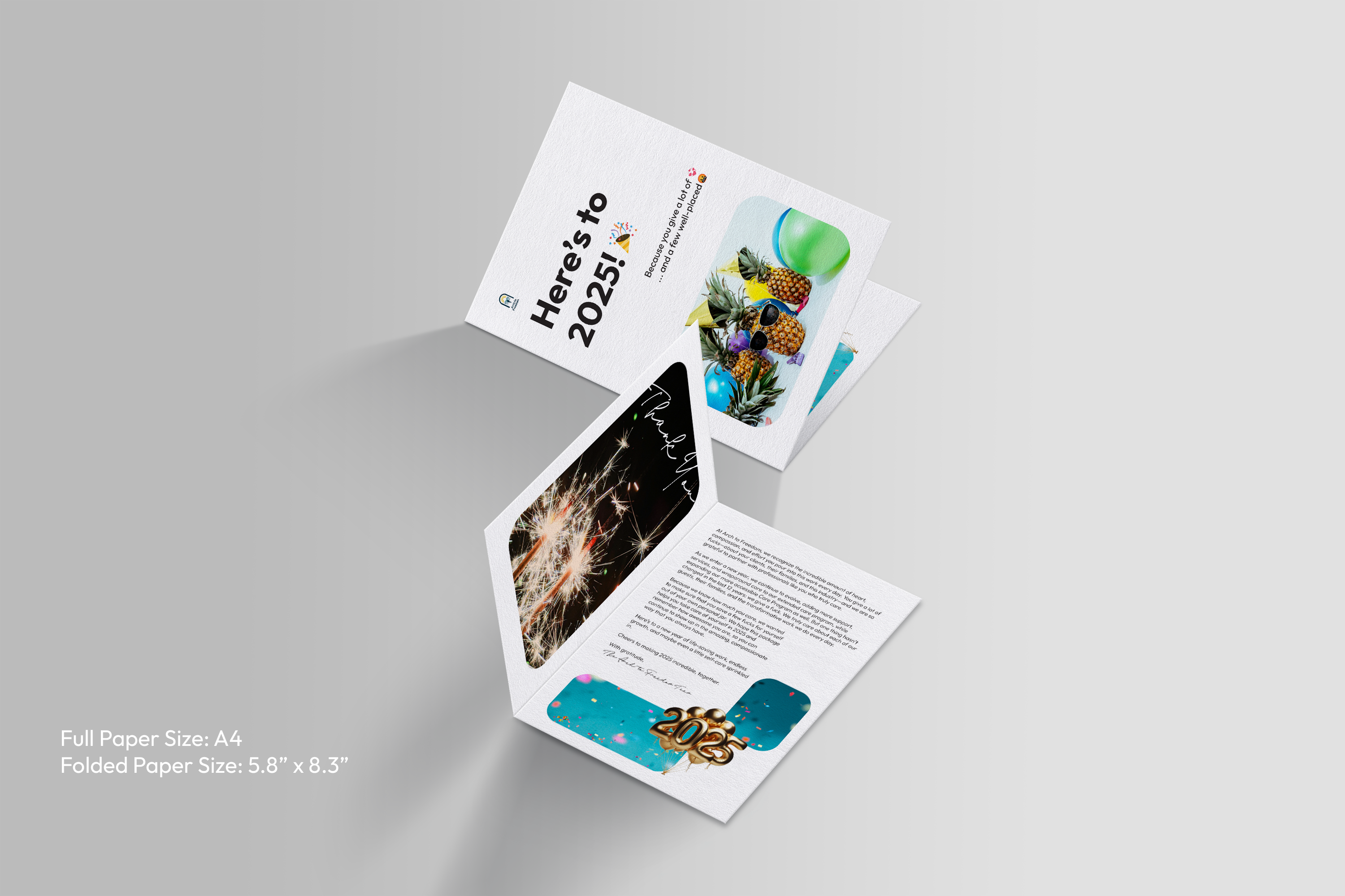
Our collaboration with The Arch to Freedom Project included a complete brand identity refresh. We reimagined their logo to better reflect their mission, designed a comprehensive brand book to establish consistency, developed a new website that highlights their values and services, and created a cohesive corporate identity system including letterhead and business cards.
The challenge.
Their previous identity leaned heavily on imagery of houses, which unintentionally positioned them closer to real estate than a recovery and healing organization. The branding failed to capture their ethos, values, and the deeply human element of their work. They needed a brand presence that communicated empathy, trust, and transformation while clearly setting them apart in their field.
Outcome.
We delivered a refreshed identity that reflects the heart of their mission—healing, recovery, and personal growth. The new logo and brand system embody their ethos with a sense of hope and transformation, while the redesigned website provides a seamless user experience that emphasizes their programs and support services. Their corporate identity now aligns with their values, projecting professionalism and authenticity in every touchpoint. The Arch to Freedom Project now stands as a trusted and inspiring beacon of recovery, with a brand identity that resonates deeply with those they serve.
Let’s bring your vision to life—strategic, bold, and made to grow.
If you’re ready for a brand that looks good and works hard, we’re here to design it with purpose, clarity, and impact.