Rann Law
Client Overview. The Rann Law Corporation is a business litigation firm based in Huntington Beach, California, led by Robert Rann, Esq. The firm provides strategic legal representation for businesses and individuals navigating high-stakes disputes, with a reputation for aggressive, trial-ready advocacy across business litigation, contract law, fraud, and real estate. Project Scope. The project covered […]
Vessela & Co
Client Overview. Vessela & Co. is a handmade home objects brand offering limited edition vases, vessels, and mini statues — each piece a small, collectible work of art. Made in limited runs, every object is designed to be as considered in a curated home as it is in a collector’s shelf. Project Scope. We built […]
Base State Studio
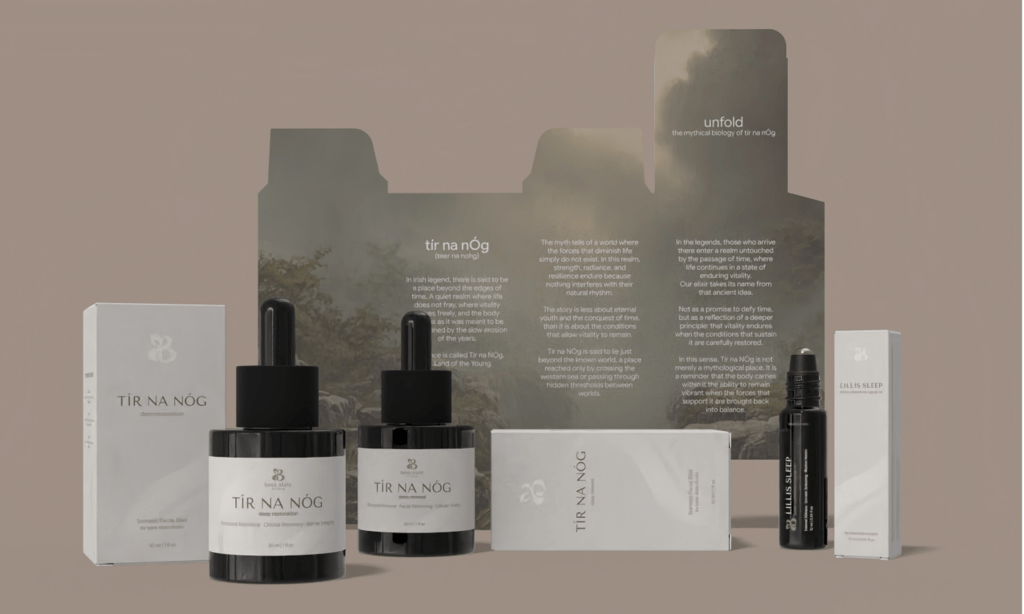
Client Overview. Base State Studio is a philosophy-led skincare brand built around somatic science and sensory intelligence. Their oil-based formulations — including the Tír na Nóg facial oils and Lillis Sleep serum — are designed to work with the body’s natural systems, supporting skin renewal, nervous system regulation, and deep rest from the inside out. Project Scope. We worked […]
Eenie Minni
Client Overview. Eenie Minni is a playful and caring pastry brand specializing in cheesecakes-in-cookie-form, delighting customers with fun, high-quality treats. Project Scope. Eenie Minni partnered with us to elevate their brand identity through a cohesive visual system. We designed and developed a playful, user-friendly website, created custom illustrations and patterns, and refreshed their packaging and […]
Cher Archange Beauty
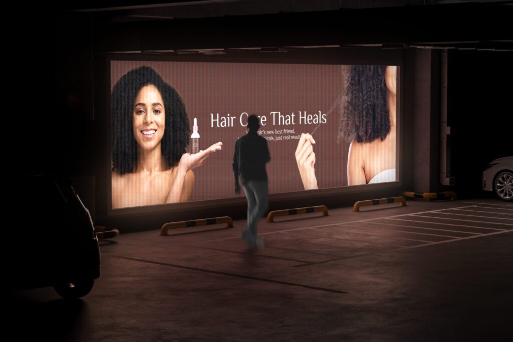
Client Overview. Cher Archange Beauty is a haircare brand dedicated to celebrating every hair type with products designed to nourish, repair, and enhance natural beauty. Their line focuses on providing effective solutions for a variety of hair concerns, from dryness and frizz to breakage and scalp health. Empowering individuals to embrace their unique hair journey […]
Arch to Freedom
Client Overview. The Arch to Freedom Project is a recovery center committed to guiding individuals on their journey to healing and transformation. Rooted in compassion and empowerment, the organization provides safe spaces and programs that focus on recovery, growth, and personal freedom. Project Scope. Our collaboration with The Arch to Freedom Project included a complete […]
Spades Sales Academy
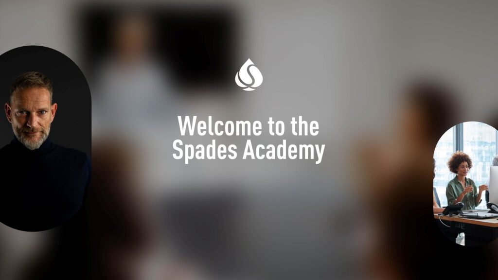
Client Overview. Spades Sales Academy is a modern training platform built for founders, B2B sales teams, and high-performing professionals. Led by a seasoned sales expert, the academy combines decades of real-world sales experience with avatar-led learning, automation, and digital tools. The brand’s promise is simple but powerful: to help people sell smarter—through systems that are […]
ideas in Spades
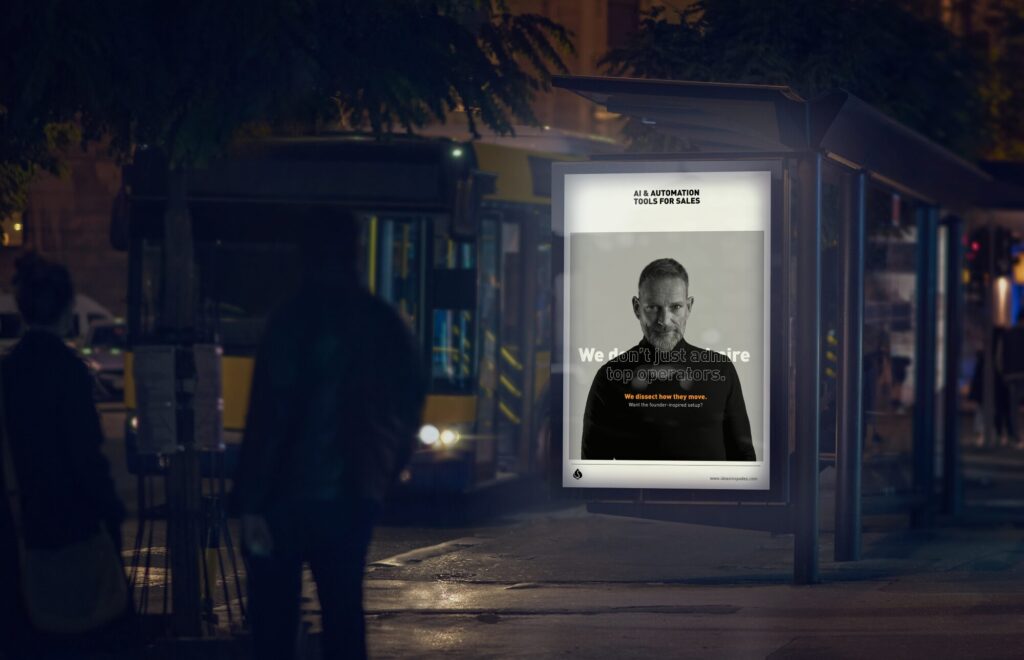
Client Overview. Ideas in Spades is a creative growth consultancy that helps startups, founders, and business leaders scale through a mix of strategic design, AI automation, and storytelling. As a HeyGen Gold Partner, they’re known for pushing boundaries—turning avatars, automation, and content systems into business tools for real-world results. Their brand needed to feel just […]
Org Box
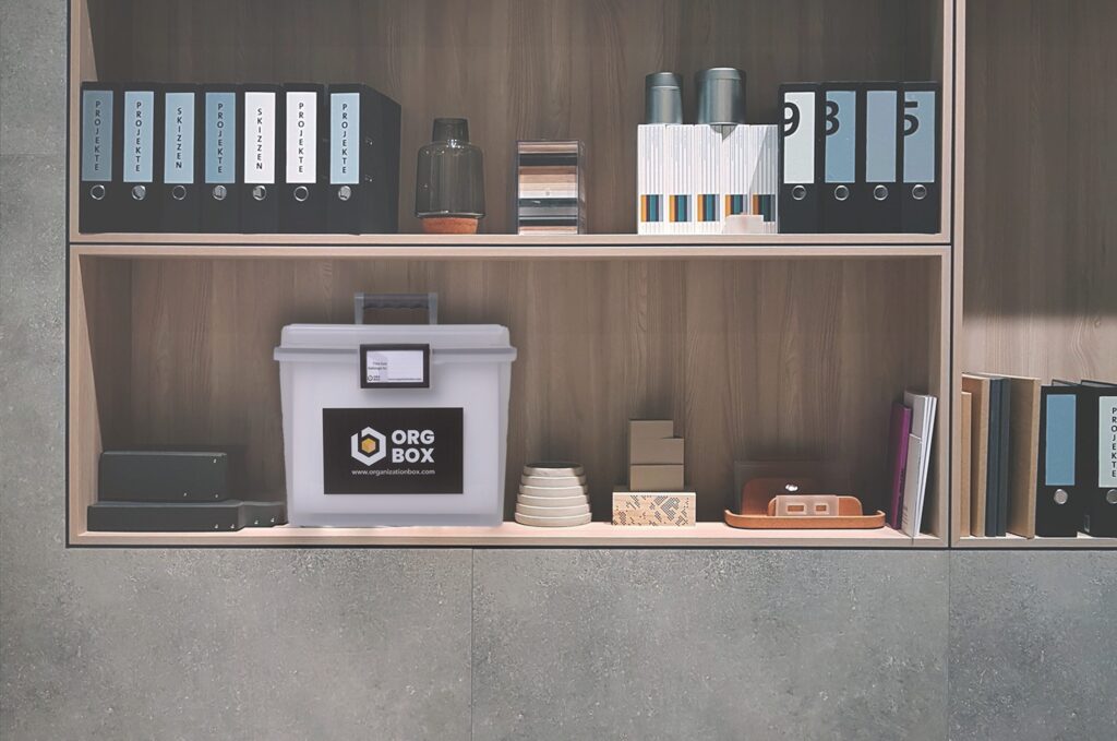
Client Overview. Org Box is a modern storage solution built specifically for parents, helping them keep life’s most important documents safe, accessible, and neatly organized. With a strong focus on ease and peace of mind, Org Box transforms the often stressful task of paperwork management into a streamlined and empowering experience Visual Identity. We took […]
Abundant Healthcare Strategies
Client Overview. Abundant Healthcare Strategies is a mission-driven healthcare consultancy dedicated to transforming systems and experiences through an abundance mindset—one rooted in collaboration, empathy, and empowerment. Their work fosters environments where healthcare professionals and organizations can thrive, ultimately improving outcomes across the board. Visual Identity. We approached the Abundant Healthcare brand with a holistic mindset—merging […]